Your office exterior is basically your business card before anyone walks through the door. These six designs prove you don’t need a corporate campus to make a massive first impression that’ll have clients pulling out their phones for photos.
1. The Modern Minimalist Box That Actually Has Soul
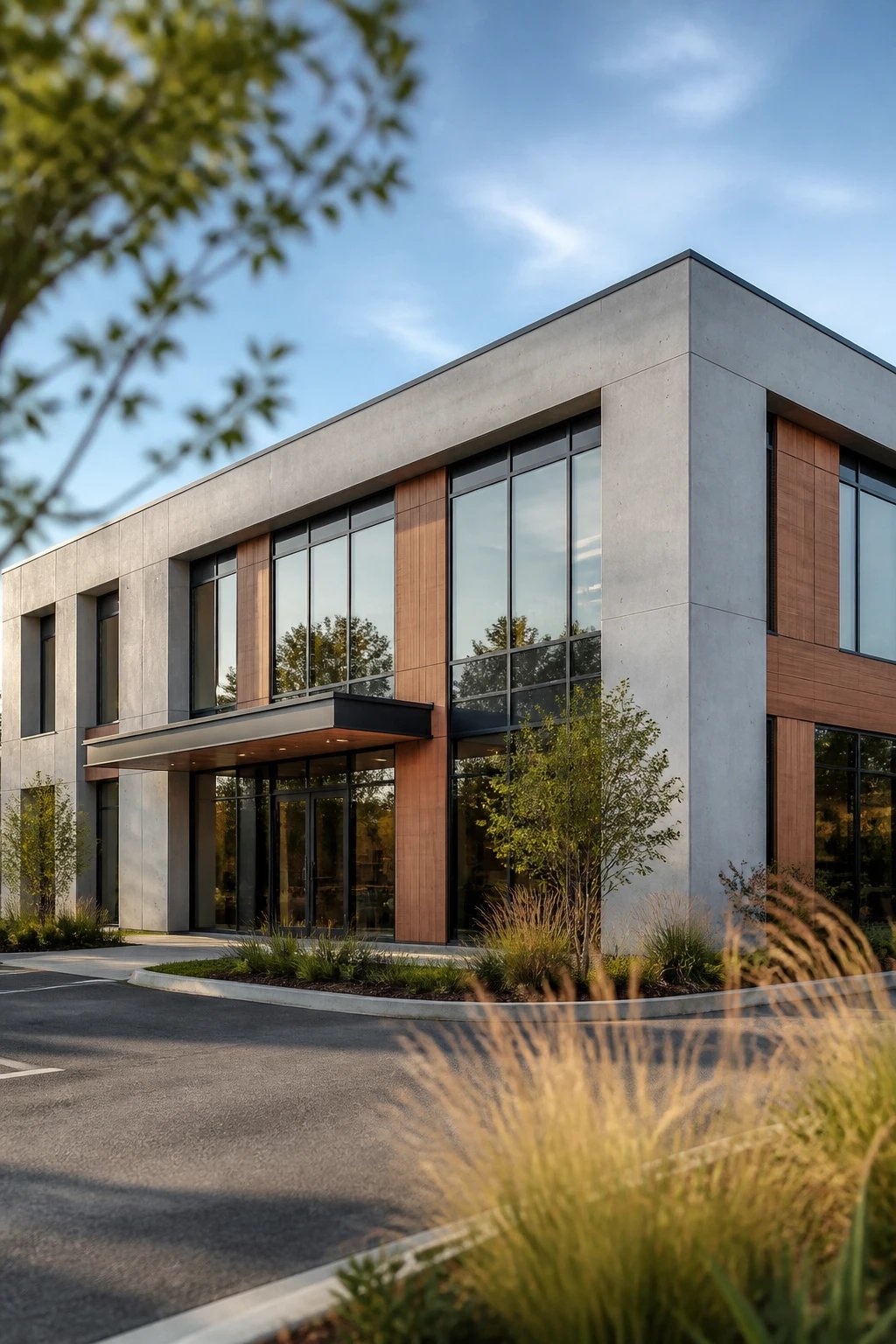
Clean lines and simple geometry don’t have to feel cold and sterile. This design approach takes the classic rectangular office structure and elevates it with intentional material choices and subtle architectural details that create visual interest without screaming for attention.
Think smooth concrete panels paired with warm cedar accents. The magic happens when you add floor-to-ceiling windows that break up those solid planes and create a rhythm across the facade.
Key Elements:
- Mixed materials (concrete, wood, glass) in a 60-30-10 ratio
- Recessed entryway that creates shadow and depth
- Strategic lighting that highlights texture after dark
- Native landscaping that softens the geometric edges
The beauty of this design is how it adapts to different climates and contexts. In urban settings, it feels sophisticated and professional. Drop it in a suburban area, and those warm wood elements help it blend with residential neighbors.
Pro tip: Don’t cheap out on the window frames. Black aluminum frames make everything look intentional and expensive, while white vinyl screams “we picked the builder-grade option.”
This approach works brilliantly for tech startups, creative agencies, and professional services firms that want to project competence without stuffiness. Plus, that simple form keeps construction costs reasonable while still delivering serious curb appeal.
2. The Glass-Front Showstopper for Maximum Transparency
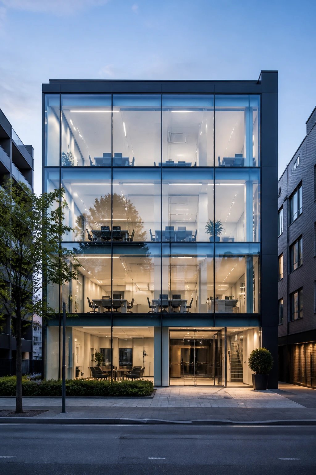
Want everyone to see exactly what happens inside your business? A full glass facade is basically an invitation that says “we’ve got nothing to hide, and yeah, our interior is that good.”
This design flips the traditional office concept on its head by making the interior your exterior design feature. Your workspace becomes part of the streetscape, creating this really cool visual connection between inside and out.
What Makes It Work:
- High-performance glazing that manages heat and UV rays
- Structural columns set back from the glass line
- Carefully designed interior that looks good 24/7
- Thoughtful privacy solutions for conference rooms
Here’s the thing though – you absolutely need to invest in quality glass. We’re talking low-E coatings and thermal breaks or you’ll roast in summer and freeze in winter. Trust me on this one.
The interior design becomes critical with this approach. You can’t have random filing cabinets and messy desks visible from the street. Everything needs to earn its place in the view.
Consider adding living walls or sculptural elements near the windows to create visual interest from outside. Strategic lighting design turns your office into a glowing lantern at night, which honestly looks incredible in photos.
This works exceptionally well for design studios, architecture firms, boutique fitness spaces, and any business where transparency builds trust. Just maybe not for therapists or accountants handling sensitive documents.
3. The Industrial Chic Warehouse Conversion
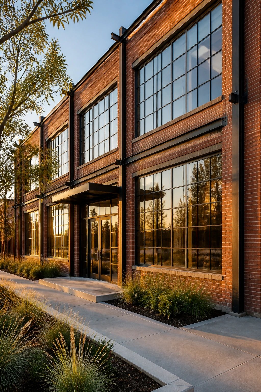
Exposed brick, steel beams, and oversized factory windows? Yes please. This aesthetic takes existing warehouse or industrial buildings and celebrates their raw, authentic character instead of fighting it.
The exterior maintains that rugged industrial vibe while strategic updates signal “we’re not actually a abandoned factory, we’re a thriving business.” It’s that perfect balance between rough and refined.
Signature Features:
- Original brick cleaned and sealed (not painted over)
- Oversized steel-framed windows – the bigger, the better
- Exposed ductwork and structural elements as design features
- Bold graphics or signage that complements the industrial vibe
- Courtyard or outdoor workspace carved from the footprint
The trick is knowing what to preserve and what to update. Keep the cool stuff like vintage loading dock doors or old painted signage. Update the boring stuff like roofing and electrical.
Add landscape elements that soften without sanitizing. Think native grasses in raised cor-ten steel planters rather than manicured hedges. The contrast between industrial hard surfaces and organic plantings creates this really compelling visual tension.
Lighting makes or breaks this look. Simple industrial pendants and wall-mounted fixtures that reference the building’s history work way better than trying to add fancy contemporary fixtures.
FYI, this approach often costs less than new construction while delivering way more character. Perfect for creative agencies, coworking spaces, craft breweries, and businesses that want personality over polish.
4. The Biophilic Beauty With Living Walls
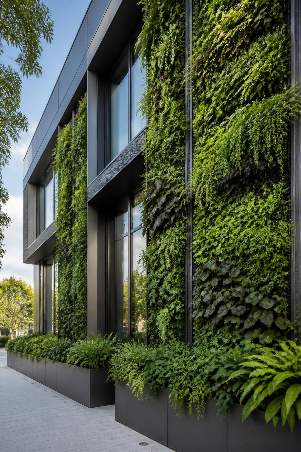
Imagine your office exterior basically wearing a living, breathing garden as part of its architecture. Biophilic design integrates nature directly into the building envelope, and the results are absolutely stunning.
We’re not just talking about some planters near the entrance. This approach uses vertical gardens, green walls, and integrated planting as actual architectural elements that change with the seasons.
Core Components:
- Modular living wall systems with irrigation built in
- Deep planter boxes integrated into the facade
- Climbing plants on cable or trellis systems
- Green roof sections visible from street level
- Natural materials like stone and sustainably-sourced wood
The practical benefits go way beyond aesthetics. These systems provide natural insulation, improve air quality, and reduce urban heat island effects. Your building literally helps the environment while looking incredible.
Maintenance is the real consideration here. You’ll need irrigation systems, seasonal plant rotation, and regular care. But honestly? The impact is so dramatic that the investment pays off in brand differentiation alone.
Choose plants appropriate for your climate and sun exposure. South-facing walls in hot climates need drought-tolerant species, while shaded northern exposures can handle ferns and shade-lovers.
This design approach works beautifully for wellness-focused businesses, environmental consultancies, organic brands, and any company whose values align with sustainability. It’s basically impossible to greenwash when your walls are actually green.
5. The Bold Color Statement That Demands Attention
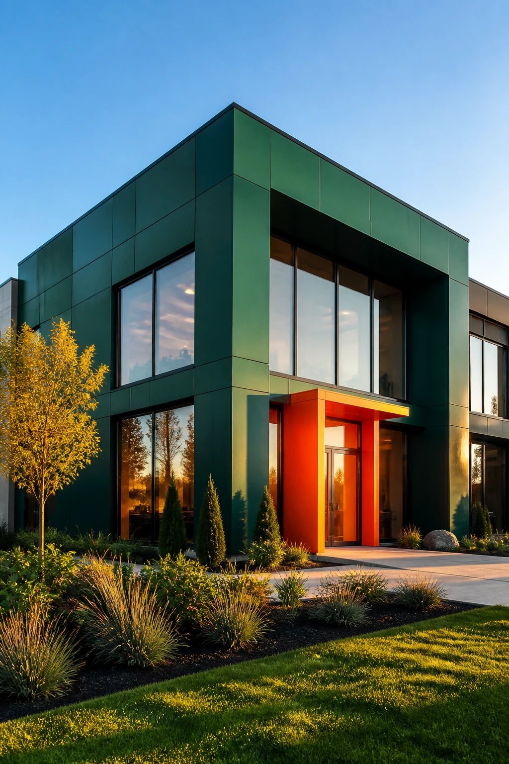
Sometimes the simplest form becomes extraordinary with one brave choice: unexpected, saturated color. This approach takes a clean, simple building shape and makes it unforgettable through strategic use of bold hues.
We’re talking deep jewel tones, vibrant primaries, or sophisticated earth tones – applied deliberately to create impact without chaos. When everyone else plays it safe with grey and beige, color becomes your superpower.
Winning Color Strategies:
- Monochromatic envelope with one contrasting accent wall
- Color-blocked sections that highlight architectural features
- Gradient or ombre effects across the facade
- Complementary color pairings (like navy and terracotta)
The key is committing fully. Timid color choices end up looking like mistakes. Go bold or go neutral – there’s no middle ground that works.
Consider your surroundings when selecting your palette. In a sea of brick and concrete, even a sophisticated forest green or burnt orange will pop. In colorful neighborhoods, you might need something more dramatic to stand out.
Pair your color choice with clean white or black accents for contrast. Window frames, door surrounds, and trim in neutral tones help that bold color really sing without overwhelming the eye.
This works especially well for businesses targeting younger demographics, creative industries, or anyone wanting to signal energy and confidence. Seriously, a accounting firm in millennial pink would be talked about for years.
6. The Courtyard-Centered Design That Blurs Boundaries
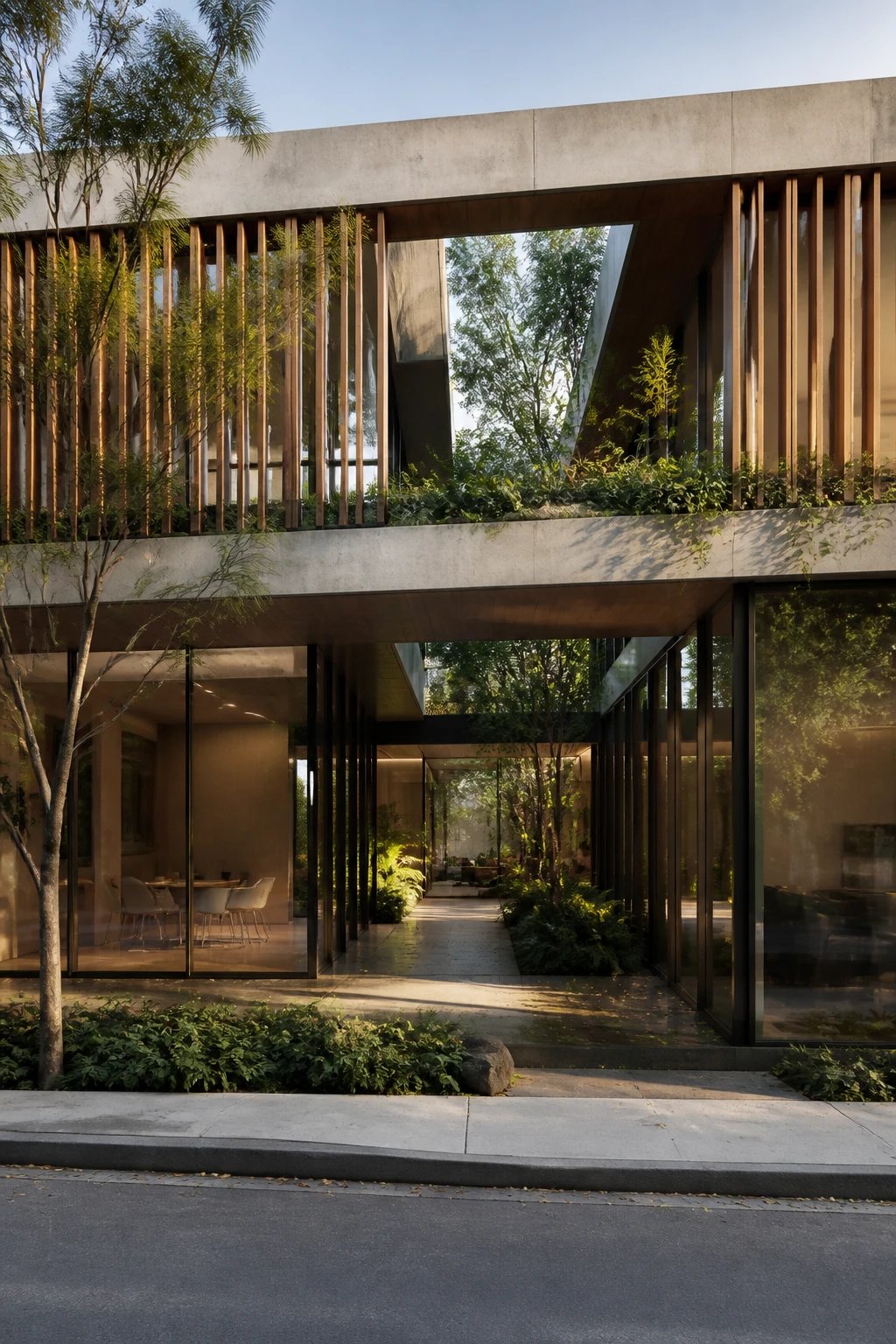
Instead of turning a blank facade to the street, this design opens inward to a central courtyard that’s visible from the outside. It creates this intriguing glimpse into a semi-private outdoor space that draws people in.
The exterior walls frame views into the courtyard while the building wraps around to create shelter and definition. It’s simultaneously inviting and exclusive – everyone can see something special, but you have to be invited inside to fully experience it.
Essential Features:
- Transparent or semi-transparent entrance that reveals the courtyard
- Mixed height walls that create visual interest from street view
- Landscape design that works as both interior and exterior space
- Water features, sculpture, or other focal points
- Covered walkways or overhangs that define circulation
The courtyard becomes your office’s heart and your most powerful marketing tool. Clients get a preview of this amazing outdoor space before they even enter, which immediately elevates their perception of your business.
Materials matter hugely here. The transition from street to courtyard should feel intentional – maybe pavers that shift from sidewalk concrete to natural stone or permeable pavers in the courtyard itself.
Lighting transforms courtyard spaces at night. Uplighting on trees, path lighting, and ambient fixtures turn the courtyard into a glowing focal point that’s visible from outside.
This design works brilliantly for professional services like law or financial firms, medical offices where patients appreciate calming environments, and any business where client meetings happen regularly. The courtyard becomes a third space between public and private that feels special without being intimidating.
IMO, this is the most adaptable design on the list. It scales from tiny lots to larger properties and works across architectural styles from traditional to ultra-modern.
Conclusion
Your small office exterior doesn’t need a massive budget to make people stop and stare – it just needs intentional design choices that reflect your brand and values. Whether you go minimal, maximal, green, or bold, the best exterior is the one that makes you excited to show up every day and makes clients confident they chose the right business.
Pick the approach that resonates with your vibe, commit to it fully, and watch your building become your hardest-working marketing asset.
—
Meta Description: Small office exterior feeling bland? These 6 stunning designs prove you don’t need a huge budget to create serious curb appeal that impresses clients instantly.
Main Keyword: “small office exterior designs”
Slug: small-office-exterior-designs-stunning-curb-appeal
0 Comments